
CSS breakpoints for responsive design
Responsive web design is an approach to make webpages render well on all screen sizes and resolutions while ensuring usability is high.
In this article, we’ll look at the evolution of responsive design, from media queries to grid systems, container queries, and finally fluid design. We’ll discuss the role of breakpoints in responsive design, reviewing different methods of choosing breakpoints and some best practices.
The evolution of responsive design
HTML is fundamentally responsive. If you create a webpage using only HTML and resize the window, the browser will automatically adjust the text to fit the viewport. However, your content will not look good on every screen!
For example, long lines of text can be difficult to read on a wide monitor. Similarly, if the line length is reduced with CSS, by creating columns or adding a margin, the content may look squashed when viewed on a mobile device. You have to intervene to adapt the style to the screen, based on the content and layout of your webpage.
The term responsive design was coined by Ethan Marcotte in 2010 and described using fluid grids, fluid images, and media queries to create responsive content. At the time, the recommendation was to use float for layout, and media queries to query the browser width or height to create layouts for different breakpoints.
A breakpoint is the point, usually a specific width, at which a webpage’s style is adapted in a particular way in order to provide the best possible user experience. Fluid images were set to not exceed the width of their container, by setting their max-width property to 100%. The prevailing attitude was to control every pixel of a layout for a given screen size.
Frameworks like Bootstrap rose in popularity as they provided developers with responsive grid systems. This contributed to a shift in the way we build and think about webpages. With the advent of design systems, there is a tendency to think in terms of components rather than pages. We combine components to make up a page and want them to live side-by-side without having to write a lot of CSS to create a harmonious layout.
With modern CSS, less intervention is required to resize or change layouts for different screen sizes. Layout methods such as Flexbox and CSS Grid have responsive capabilities, and other modern methods have been developed to make content responsive:
- clamp() function: Allows typography and spacing to be responsive to the viewport width
- Container queries: Enables a component to be responsive to its wrapper
- Logical properties: Permits spacing to be responsive to the language of the website
In 2018, Jen Simmons introduced the term “Intrinsic Web Design” in her talk “Everything You Know About Web Design Just Changed.” Here are her three principles of intrinsic web design:
- Contracting and expanding: The way we consider how our design will adapt to a change in available space
- Flexibility: Using modern CSS functions to adapt to the available space
- Viewport: The ability to use the width and height of the viewport as input to a responsive design
Today, more people generally advocate going with the grain with regard to how content adapts to the space available. As Andy Bell put it recently, maybe our preference should be to: “be the browser’s mentor, not its micromanager.”
With the recent introduction of container queries, we are entering a new era of responsive design. Container queries allow us to look at a container size and apply styles to the content based on the size of their container rather than the viewport or other device characteristics. I see this more as an evolution than a revolution because now CSS can align more easily with component-based thinking.
Some people see container queries as a departure from what came before because now a design can be largely independent of the viewport size. However, container queries still involve breakpoints. So, we still need to consider where and when (at what point) to change the style of content.
While we have moved on from float for layouts, media queries are still relevant. They are just required less frequently than before. People have been predicting the end of media queries with the introduction of container queries, but container queries do not solve everything. Media queries still have a seat at the table. It will take some maturation before the roles are worked out with more clarity.
Let’s cover media queries first before we dive into breakpoints.
What are media queries?
Media queries are useful when you want to modify the layout or appearance of your site depending on specific characteristics such as the screen resolution of the device or the browser viewport width or height.
A media query is composed of:
- An optional media type defining a broad category of devices to which the media query applies:
all,print, orscreen. This type is optional; it is assumed to beallif omitted - Any number of media feature expressions describing a specific characteristic of the user agent, output device, or environment. Examples are:
hover,prefers-reduced-motion, andwidth
The common syntax for a CSS media query is as follows:
@media media type and (media feature expression) {/* CSS rules */}
The logical operators not, and, only, and or can be used to compose a complex media query.
For responsive design, min-width and max-width are the most commonly used media features. They enable styles to be based on the width of the viewport. For example, the following CSS code will apply styles only if the browser’s viewport width is equal to or less than 80em:
@media (max-width: 80em) {/* CSS rules */}
You can also use height (height, min-height, and max-height), aspect-ratio, resolution, and orientation in media feature expressions to deal with the viewport’s dimensions and different aspects of the screen.
The Media Queries Level 4 specification includes some syntax improvements to make media features that have a less verbose “range” type, e.g., width. With this syntax improvement, our previous max-width example could be written like so:
@media (width <= 80em) {/* CSS rules * }
At the time of writing, this new range syntax is in Chrome and Firefox and will be available soon in Safari.
How do you choose breakpoints?
A breakpoint is the point, usually a specific width, at which a webpage’s style is adapted in a particular way in order to provide the best possible user experience.
There are two broad approaches when choosing CSS breakpoints; one is based on devices and the other is based on content. Let’s take a look.
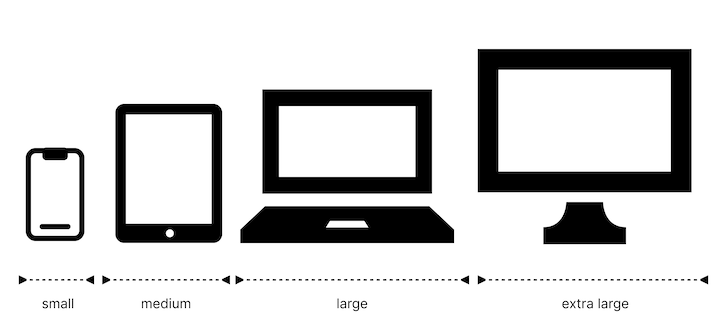
Breakpoints based on device
You can target and produce a different design for specific screen sizes. A design may work across multiple screen sizes, however, the content may be narrower when less space is available.
With the breadth and variety of devices available, determining breakpoints based on screen sizes is challenging. This approach is really not feasible to maintain:
To simplify this approach, people tend to loosely group devices based on a range of sizes. It’s really up to you to choose the groupings and specific breakpoints. The most common way is to group devices based on form factor (e.g., mobile devices, tablets, laptops, etc.):
Here is some data you could use to arrive at this decision:
- Worldwide stats for the most common screen resolutions for 2022
- Data analytics metrics from your website
- Breakpoints selected by CSS frameworks (we’ll discuss this further in the next section)
For example, David Gilbertson wrote an article in 2016 with the ambitious title: “The 100% correct way to do CSS breakpoints.” I am always skeptical of such clickbaity claims! However, David’s approach was solid. He arrived at his set of breakpoints by taking the 14 most common screen sizes from StatCounter for 2016 and grouping them using four broad ranges. He avoided selecting screen widths that were on the upper or lower limit of the ranges. Ultimately, David settled on 600px, 900px, 1200px, and 1800px.
You will find that most methodologies arrive at a set of breakpoints in a similarly approximate fashion.
Below is an example of a set of media queries covering four broad categories of devices:
/* Small devices such as large phones (640px and up) */@media only screen and (min-width: 40em) {...} /* Medium devices such as tablets (768px and up) */@media only screen and (min-width: 48em) {...} /* Large devices such as laptops (1024px and up) */@media only screen and (min-width: 64em) {...} /* Largest devices such as desktops (1280px and up) */@media only screen and (min-width: 80em) {...}
Breakpoints based on content
This next approach is based on changing the design at the point where the content starts to break in some way. If the line lengths become too long, or if a section gets too squashed, that’s where you need to consider changing the style. In other words, that’s the point where you want to use a media query or container query to change the design.
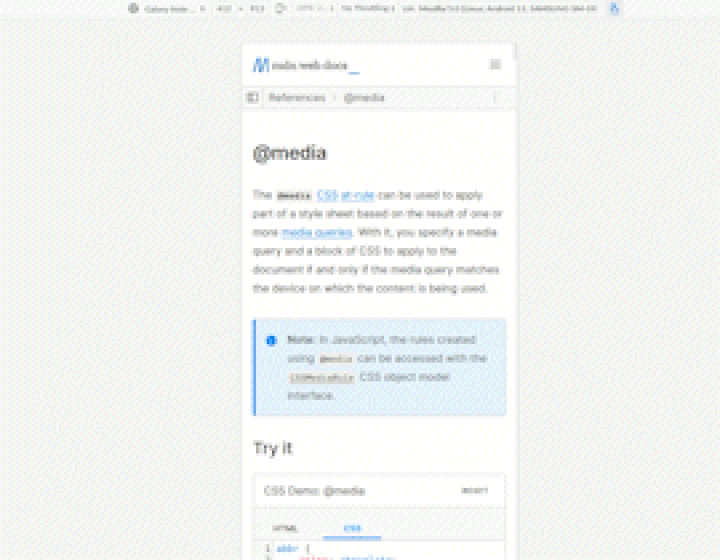
The responsive mode in browser developer tools (Responsive Design Mode in Firefox DevTools and Device Mode in Chrome DevTools) is very useful for working out where your breakpoints should go. You can easily make the viewport smaller or larger to see where the content style could be improved:
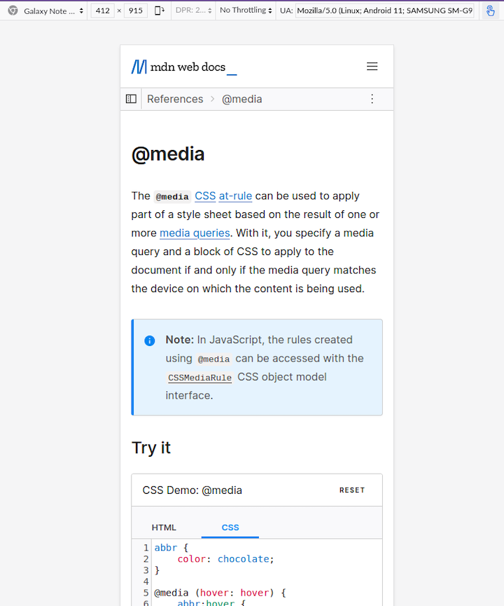
In the menu, you can choose devices from a list. In the screenshot above, I have chosen Galaxy Note 20. You can change the orientation (e.g., portrait, landscape) as well.
You can drag one side of the viewport to slowly increase the width and see how the content adapts to different viewport widths. In the video below, you can see me doing this with the MDN @media page. At 769px, you’ll notice that the layout changes with the sidebar appearing on the left:
Jeremy Keith called out that some breakpoints are for minor adjustments, he calls them tweakpoints:
“When I was working on Matter, for example, there was really only one major breakpoint, where the layout shifts from one column to two. That’s the kind of breakpoint that you can figure out pretty easily from the flow of your content; just resizing your browser window is usually enough to settle on the point that feels right. But there are lots of other media queries in the Matter stylesheet. Those are there to make smaller adjustments to margins, font sizes …the kind of changes that came about from testing on phones and tablets in the device lab.
It feels a bit odd to call them breakpoints, as though the layout would “break” without them. Those media queries are there to tweak the layout. They’re not breakpoints; they’re tweakpoints.”
Overall, this is an organic process that is guided by what you are specifically making. Adjacent to this is the understanding that if you have a mastery of modern CSS, you will find that you need to intervene less with media queries if you build things to scale according to the available space.
Which approach should you follow?
I wouldn’t say that there is one path to follow here. However, I recommend that you do not constrain yourself by thinking only in terms of particular devices. Instead, focus more on utilizing the space available to your content.
Generally, we will use media queries less as time goes on. Media queries are likely to still be used for components that are tied to the viewport width like the website’s main navigation and footer. In other cases, you can design content to be fluid, or adapt to the container size through container queries.
There can be value in having a set of breakpoints. Whether you take a set from the first approach or come up with the breakpoints organically through testing the interface is up to you. I would say that it is easier to debug layout issues when you have a set of breakpoints, rather than having many adhoc breakpoints.
However, having a set of 6 breakpoints does not mean you should use them all to adjust a layout or style! Look to minimize intervention – look for opportunities for the content to do the work for you!
What breakpoints do popular CSS frameworks use?
According to the State of CSS survey, the most popular CSS frameworks of 2022 (ordered in terms of usage) are:
Let’s look at what these popular frameworks do.
You can see the default breakpoints for Bootstrap 4 below:
| Breakpoint | Dimensions |
|---|---|
| X-Small | < 576px |
| Small | ≥ 576px |
| Medium | ≥ 768px |
| Large | ≥ 992px |
| Extra large | ≥ 1200px |
| Extra extra large | ≥ 1400px |
Bootstrap uses a 12-column grid architecture, which influences its choice of breakpoints. Bootstrap describes its methodology for choosing breakpoints as follows:
“Each breakpoint was chosen to comfortably hold containers whose widths are multiples of 12. Breakpoints are also representative of a subset of common device sizes and viewport dimensions—they don’t specifically target every use case or device. Instead, the ranges provide a strong and consistent foundation to build on for nearly any device.”
Ant Design also follows the Bootstrap 4 media queries rules.
Tailwind has five default breakpoints that are inspired by common device resolutions:
| Key | CSS Media Query | Applies |
|---|---|---|
| none | none | < 640px |
sm | @media (min-width: 640px) { ... } | ≥640px |
md | @media screen and (min-width: 768px) | ≥768px |
lg | @media screen and (min-width: 1024px) | ≥1024px |
xl | @media screen and (min-width: 1280px) | ≥1280px |
2xl | @media screen and (min-width: 1536px) | ≥1536px |
PureCSS has seven default breakpoints:
| Key | CSS Media Query | Applies |
|---|---|---|
| none | none | < 568px |
sm | @media screen and (min-width: 35.5em) | ≥568px |
md | @media screen and (min-width: 48em) | ≥768px |
lg | @media screen and (min-width: 64em) | ≥1024px |
xl | @media screen and (min-width: 80em) | ≥1280px |
xxl | @media screen and (min-width: 120em) | ≥1920px |
xxxl | @media screen and (min-width: 160em) | ≥2560px |
x4k | @media screen and (min-width: 240em) | ≥3840px |
PureCSS favors em for its default widths instead of px to support zooming on webpages.
Here’s a summary of breakpoints for some of the other frameworks:
- Foundation: <640px, ≥640px, ≥1200px
- Bulma: <769px, ≥769px, ≥1024px, ≥1216px, and ≥1408px
- Semantic UI: <768px, ≥768px, ≥992px, ≥1400px, ≥1920px
- Primer: <544px, ≥544px, ≥768px, ≥1012px, ≥1280px
- UIKit: <479px, ≥480px, ≥768px, ≥960px, ≥1200px
Common practices for breakpoints
Here are some important best practices to keep in mind regardless of which CSS framework you ultimately select:
- Design for mobile first: With approximately 59% of overall web traffic coming from mobile devices, it makes sense to favor designing for mobile screens. Prioritizing design for mobile devices also ensures that key constraints are tackled early. However, having less space is more challenging; it compels designers to remove anything that isn’t necessary. Once you’re happy with the mobile layout, you can add and adjust for larger screens
- Use relative units: Using relative units, such as
em, allows the media queries to respond appropriately when people zoom into the webpage. Check out this article by Brad Frost for some background on using relative units within media queries - Avoid breakpoints that push devices into much smaller or larger ranges: One thing you‘ll notice from the breakpoints chosen by CSS frameworks is that their cutoff for tablet-sized devices is around 768px. This is because older generations of iPad (now iPad mini) have a resolution of 768px by 1024px. If you have breakpoints with broader ranges, be mindful of these cutoff points. Usually, you’ll see 768px and above as the medium breakpoint category. If you’re basing breakpoints on content, this is less of a concern
Do you really need breakpoints?
Some techniques have emerged that allow elements to scale proportionally and fluidly without using breakpoints. Sometimes this is referred to as fluid design.
Many fluid design techniques use mathematical functions available in CSS such as: clamp(), min(), and max(), along with dynamic units based on the viewport such as vh and vw to create expressions that will scale elements. If you would like to learn more about this, here’s an article on flexible layouts without media queries.
One systematic approach to fluid design is Utopia. Utopia advocates for designers and developers to share a systematic approach to fluidity in responsive design. Instead of designing for any particular number of arbitrary breakpoints, you design a system within which elements scale proportionally and fluidly. This can help you to:
- Design and code minimally and elegantly
- Streamline collaboration between design and development roles
- Ensure visual harmony and consistency
Utopia is like a fancy calculator that will spit out some CSS; just input some dimensions and a preferred scale to determine the range of values.
For example, this is how the fluid space calculator looks:
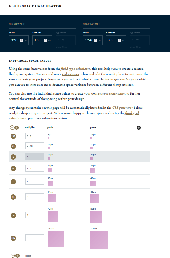
If you use clamp() in Utopia’s calculator, it will generate the following CSS snippet:
https://utopia.fyi/space/calculator?c=320,18,1.2,1240,20,1.25,5,2,&s=0.75|0.5,1.5|2|3|4|6,s-l&g=s,l,xl,12
No media query is required here. You can use these CSS variables in your padding and margins to create proportional spacing between elements throughout your website.
You can achieve fluidity with typography, spacing, and grid-based layouts. However, this may not be enough to make a completely responsive website.
Final thoughts
Responsive design is challenging, but it’s getting easier. Nowadays, choosing breakpoints is less fraught. There’s a wider acceptance that we are not trying to create a pixel-perfect rendering of a website across many screen sizes.
CSS has evolved a lot and now it is possible to create fluid designs that adapt to the available space and require less intervention. However, it is still important to understand breakpoints, you will need them sometime!
Now you can choose breakpoints according to the content and the design task in front of you, rather than follow a prescribed path. There is the option to implement breakpoints according to the viewport (media queries) or according to blocks of elements (container queries). This will simplify the process of creating responsive designs in the long run.