Introduction to Accessibility
What is Accessibility
When websites and web tools are properly designed and coded, people with disabilities can use them. However, currently many sites and tools are developed with accessibility barriers that make them difficult or impossible for some people to use. Making the web accessible benefits individuals, businesses, and society.
Similar Fields
- Web Performance
- Internationalization
- UI Design
Web accessibility means that people with disabilities can use the Web.
More specifically, Web accessibility means that people with disabilities can perceive, understand, navigate, and interact with the Web, and that they can contribute to the Web.
Some Statistics
- 26 percent (one in 4) of adults in the United States have some type of disability.
- 2 in 5 adults age 65 years and older have a disability
- 20 percent of people in the US (48 million people) report some degree of hearing loss, and 29 million of them could benefit from using hearing aids.
- 2.3 percent of people in the US (7 million people) report having a visual disability, and 1 million people in the US are legally blind.
- 16 percent of people in the US (39 million people) have difficulties with their physical functioning. 17.1 million people would find it very difficult or impossible to walk unassisted for a quarter mile.
- Roughly 8 million people in the US have an intellectual disability, including 425,000 children.
Types of disabilities
- Mobility and physical
- Cognitive and neurological
- Visual
- Hearing
The web is already accessible (even if your website is not)
For example, let's check out The first website . It's very easy to use with assistive technologies.
Reasons developers should learn accessibility
- It's fun!
- We're the ones making it inaccessible
- Human Rights
- Legal Issue
- Reach a larger audience
- Impactful
- Makes you a specialist
Amazing ways people use the web
Keyboard Only
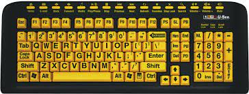
Head Wand

Mouth Stick

Single Switch

Screen Reader

Curb cut effect

Accessibility Standards
Web Content Accessibility Guidelines (WCAG)
WCAG specifies three different conformance levels they are:
- A (lowest)
- AA (mid range)
- and AAA (highest)
Level A sets a minimum level of accessibility and does not achieve broad accessibility for many situations. For this reason, UC recommends AA conformance for all Web-based information.
WebAIM
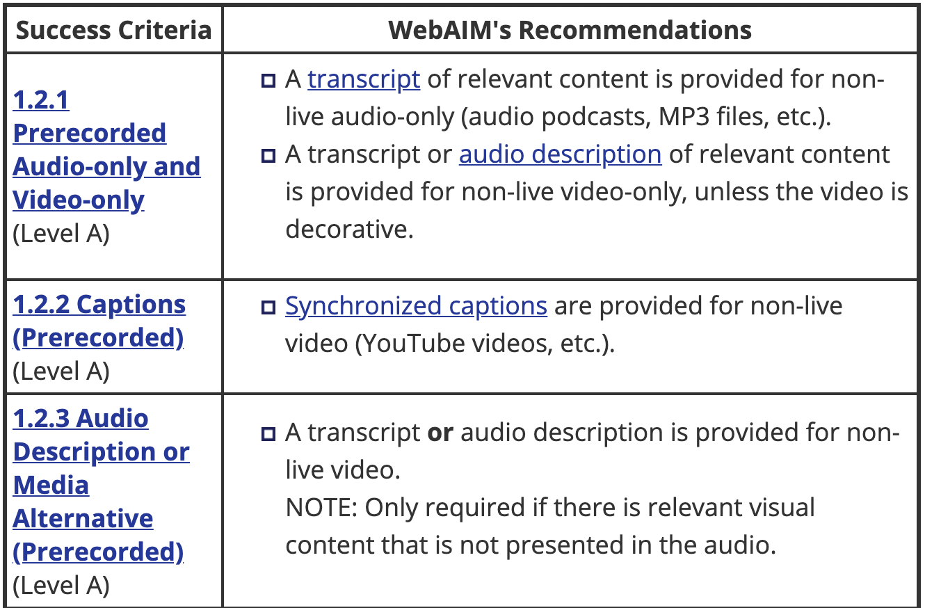
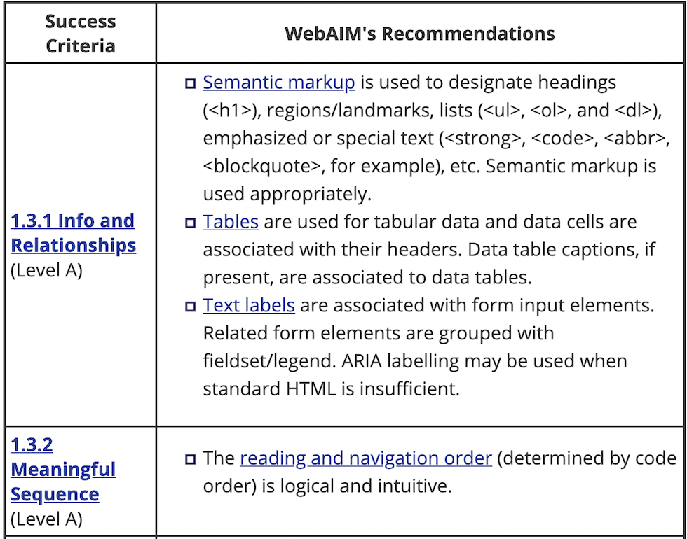
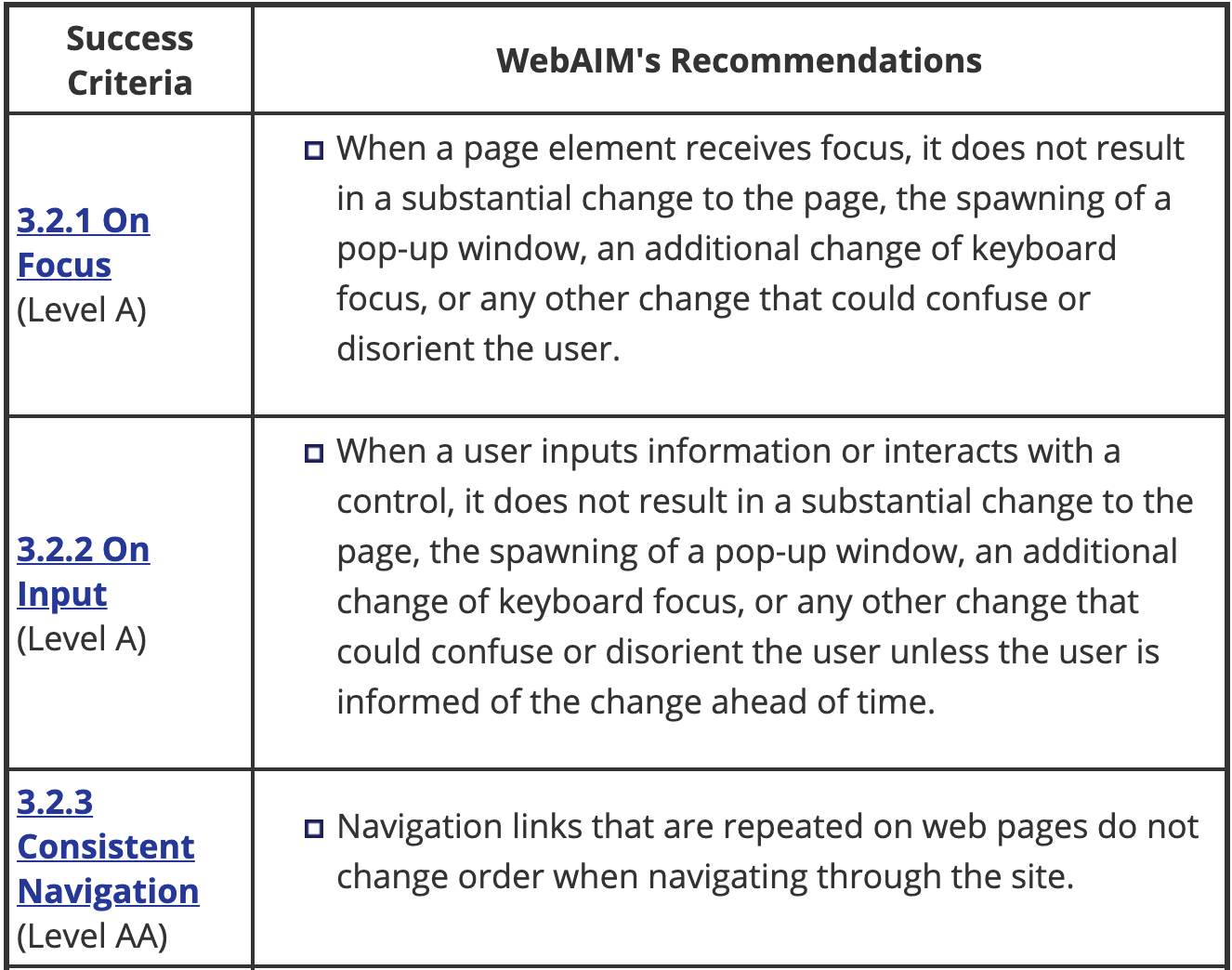
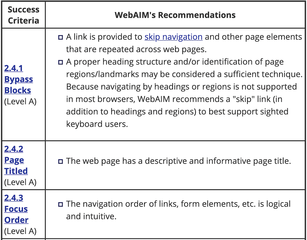
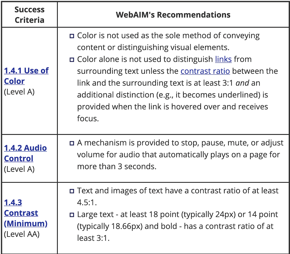
WebAIM provides a handy checklist with their recommendations.
WebAIM specifies that accessible websites should be:
- Perceivable
- Operable
- Understandable
- Robust
Screen Readers
How they work
Screen readers convert digital text into synthesized speech. They empower users to hear content and navigate with the keyboard. The technology helps people who are blind or who have low vision to use information technology with the same level of independence and privacy as anyone else.
What all they let you do
- Read all content
- Display a list of links
- Display a list of headings
List of popular screen readers
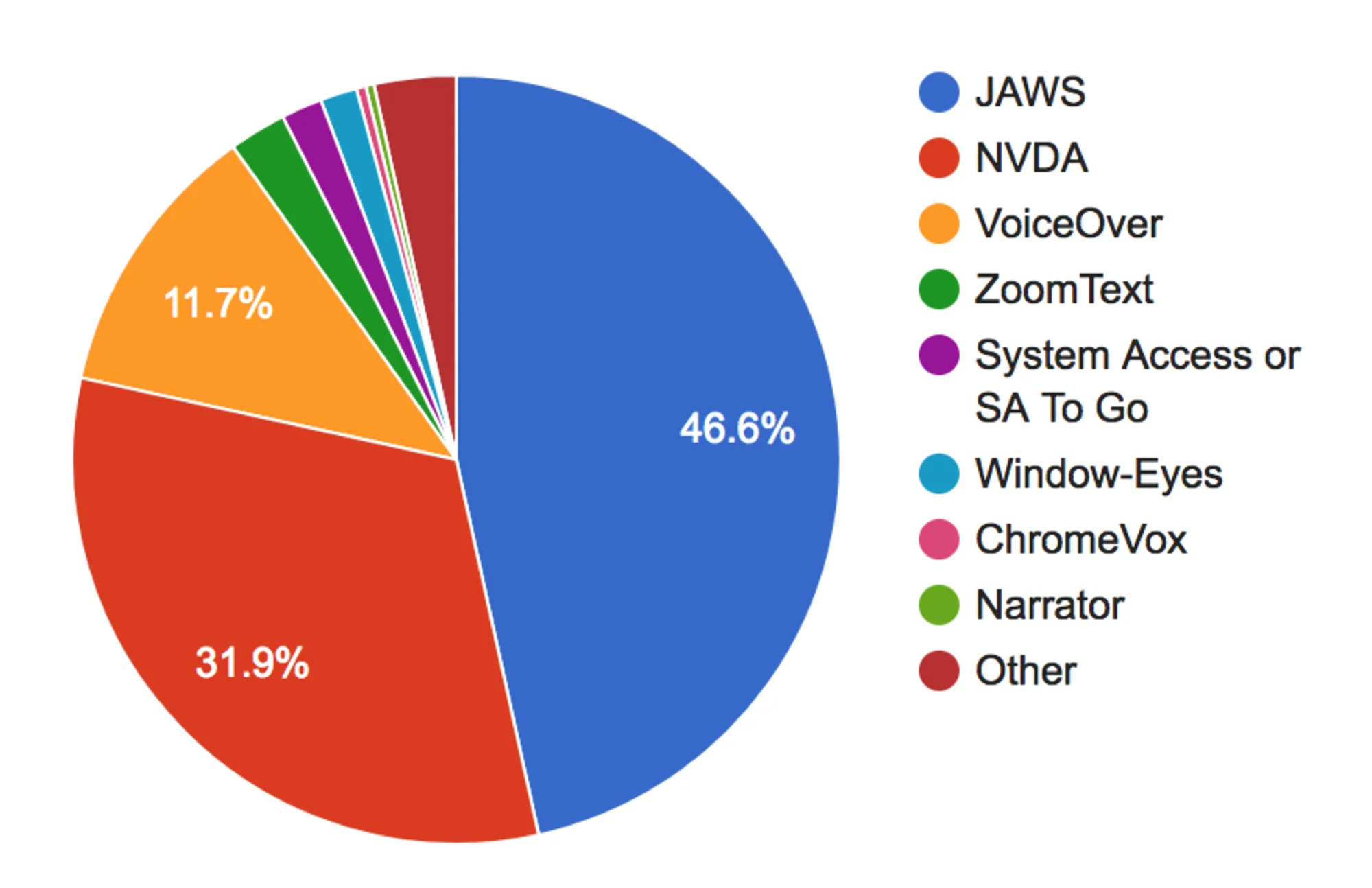
Voiceover for Mac
How to enable VoiceOver for Mac
- System Preferences
- Accessibility
- VoiceOver
- Enable VoiceOver
- cmd + f5
Chrome screen reader
Google offers a free screen reader built into the browser which you can download as an extension here.
NVDA for Windows
The most popular free screen reader for Windows is NVDA and can be found here.
Alternative Text
By default, when a screen reader encounters an image, if it can't find alt text it will read aloud the file's name.
This gets especially tricky for user generated images which often get hashed file names.
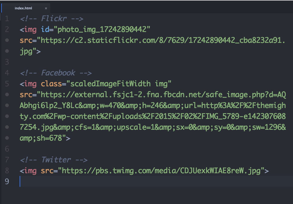
Adding an alt attribute will override that behavior. Screenreaders will read the alternative text instead of the file name.
<img src="https://pbs.twimg.com/media/KSJHECKJH983er.jpg" alt="A puppy in the park" />
Skipping over images
Sometimes your website will have images that are strictly for decorative purposes. In that case, an empty alt attribute will force the screen reader to skip over the image.
<img src="https://pbs.twimg.com/media/KSJHECKJH983er.jpg" alt="" />
A note on SEO
Search engines also make use of alternative text. For years SEO shops have suggested stuffing the keywords you want to rank for into alt text wherever possible. This provides a very bad accessibility experience.
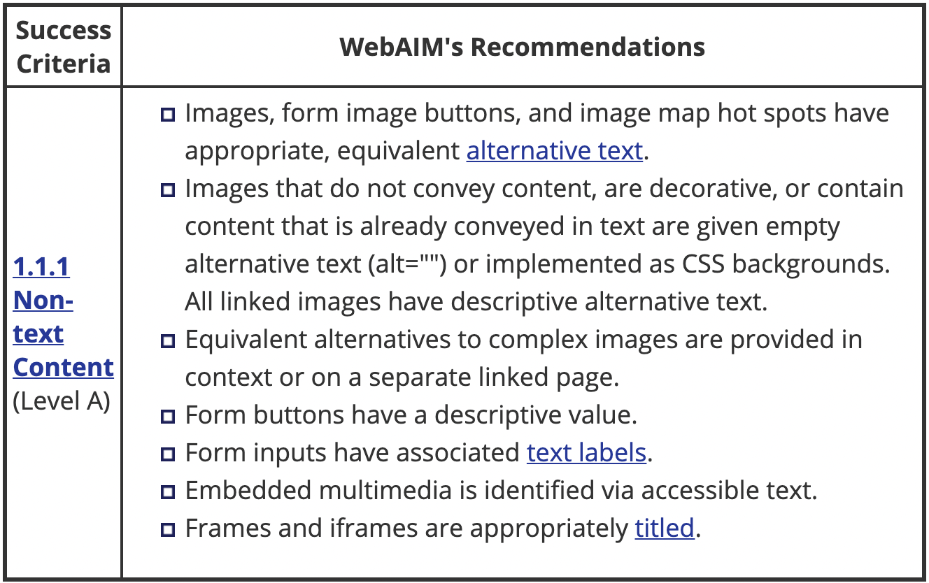
Captions for audio
Remember not all content on the web is visual! If your application has video content, be sure to use a captioning service to add closed captioning.
Accessible HTML
Semantic Elements
Some elements have semantic meaning but no special functionality. Examples are:
- <aside>
- <footer>
- <header>
Other's provide a lot of built-in functionality such as:
- <button>
- <input>
- <textarea>
Labels
Form fields can be confusing for screen reader users. There are many ways to label form fields so the label is read out loud whenever the field has focus.
Visual only labels
A common pattern is using div's or paragraph tags to label form fields.
          <form>
            <p>First Name</p>
            <input type="text" />
            <p>Last Name</p>
            <input type="text" />
            <p>Password</p>
            <input type="password" />
            <input type="submit" value="Submit" />
          </form>
First Name
Last Name
Password
HTML labels
A better option is to use the HTML label tag which will allow screen readers to recite the label when the field is focused.
          <form>
            <label for="first">First Name</label>
            <input id="first" type="text" />
            <label for="last">Last Name</label>
            <input id="last" type="text" />
            <label for="password">Password</label>
            <input id="password" type="password" />
            <input type="submit" value="Submit" />
          </form>
First Name Last Name Password
Implicit HTML labels
Another cool trick you can do is wrap your inputs with the label tag. This is called implicit labelling.
          <form>
            <label>
              First Name
              <input id="first" type="text" />
            </label>
            <label>
              Last Name
              <input id="last" type="text" />
            </label>
            <label>
              Password
              <input id="password" type="password" />
            </label>
            <input type="submit" value="Submit" />
          </form>
First Name Last Name Password
Limitations with the <label> tag
The label tag can only works with "labelable" elements. Those include:
- <button>
- <input>
- <keygen>
- <meter>
- <output>
- <progress>
- <select>
- <textarea>
If you ever need to label an element not on that list, use aria-label instead.
<div aria-label="Interactive div">Hello</div>
Screenreader only content
Sometimes you'll want to communicate with a screen reader directly! One cool example is announcing to screen reader users that you offer accessibility features! In that case you can make some HTML and wrap it in a visually hidden class.
          .visuallyhidden {
            position: absolute;
            left: 0;
            top: -500px;
            width: 1px;
            height: 1px;
            overflow: hidden;
          }
The life of a button
Let's take a regular button like the one below:
Click me!
This is generated by the following code:
<button onclick="alert('hello')">Click me!</button>This looks like a simple piece of markup but there is a lot of functionality behind that button tag!
Let's start with a different element, say a div tag.
1. We start with a div
<div onclick="alert('hello')">Click me!</div>2. We could give it an ARIA role - (more on ARIA later)
This will let screen readers know the element can be clicked.
<div role="button" onclick="alert('hello')">Click me!</div>3. We could give it a tabindex
This will allow keyboard only users to tab to it.
<div tabindex="0" role="button" onclick="alert('hello')">Click me!</div>4. Don't forget about keyboard only users!
<div tabindex="0" role="button" onclick="alert('hello')" onkeyup="alert('hello')">Click me!</div>5. Don't forget about screen reader users either!
<div aria-label="Alert the word hello" tabindex="0" role="button" onclick="alert('hello')" onkeyup="alert('hello')">Click me!</div>ARIA
Check out the official ARIA Documentation.
For a complete list, also see the official spec.
Labels
Earlier, we learned about the <label> tag in HTML and how it can be used to label certain form elements.
The ARIA spec provides us with great tools for labelling and describing any element we want. They are:
- aria-label
- aria-labelledby
- aria-describedby
What is the difference between labelledby and describedby?
A label provides essential information about an object, while a description provides extended information that the user might need.
Roles, States and Properties
ARIA also provides roles which can be applied to any element. Examples include:
- button
- checkbox
- tree
- banner
- aria-autocomplete
- aria-haspopup
For a full list of all roles, states and properties click here.
CSS Selectors
          .dropdown[aria-expanded="false"] .icon::after {
            content: '▶';
          }
          .dropdown[aria-expanded="true"] .icon::after {
            content: '▼';
          }
Live Regions
Applications can become very dynamic. For cases where important information could be coming in at any time, the ARIA spec provides the ability to mark an element as containing live data so that screen readers can read out updates as they come.
Think of using the Uber app to hail a ride. At first your status will be "waiting for a ride" but at an undetermined time it will change to "drive en route". For this we could:
<div aria-live="assertive">Waiting for a ride</div>
Then, all we have to do is update the content of that div and any assistive technology will let the user know.
One of my favorite APIs, the value that you pass in to aria-live is a politeness setting. You can pass in:
- assertive - will interrupt whatever it's doing to announce.
- polite - will announce the live region update when it next idles.
- off - will not read the update.
Focus Management
Keyboard only users
As users navigate around using only the keyboard, focus rings provide a necessary clue as to the currently active item.
Keyboard Shortcuts
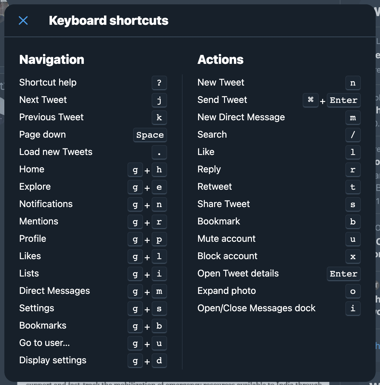
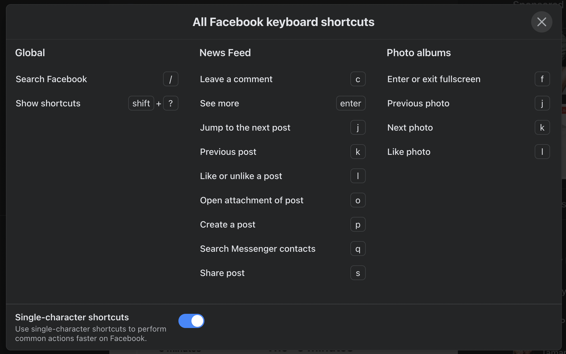
Keyboard shortcuts are another curb cut example. Sites like Twitter and Facebook offer keyboard shortcuts for almost any action which are great for both keyboard only users and and power users!
Skip links
Skip links help users skip over large headers and navigation and jump right into the "main" content of your site. When a user hits tab for the first time, a button will appear and offer users to jump right to the main section.
Github

NYTimes

How to make a skip link
- Create an anchor with the body "Skip to content"
- Prepend it to the body of your website
- Make it visually hidden
- Give it a focus state which makes it visible
Tab Navigation
You can use the tab key to navigate to the next tabbable item and shift + tab to navigate to the previous item.
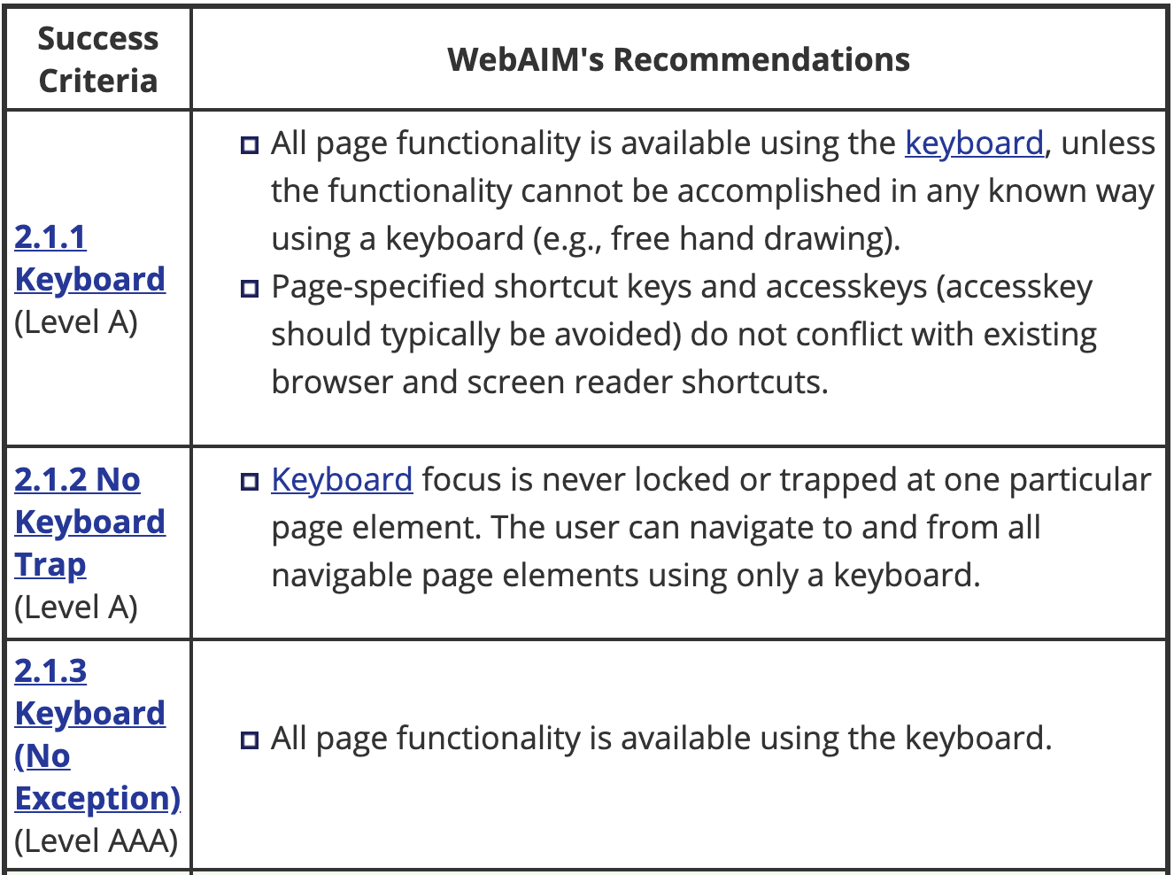
Tabbable elements include:
- <a>
- <button>
- <input>
- <select>
- <textarea>
- <iframe>
For a list of all focusable elements check out Focusable.
Making an element tabbable
You can add the tabindex attribute to any element like this:
<div tabindex="0">I'm focusable</div>Tabindex values
- a negative value means that the element should be focusable, but should not be reachable via sequential keyboard navigation;
- 0 means that the element should be focusable and reachable via sequential keyboard navigation, but its relative order is defined by the platform convention;
- a positive value means should be focusable and reachable via sequential keyboard navigation; its relative order is defined by the value of the attribute: the sequential follow the increasing number of the tabindex. If several elements share the same tabindex, their relative order follows their relative position in the document.
I would like to hear more about the maximum value for tabindex in HTML.https://t.co/WtKxdMWgiw pic.twitter.com/Z7L9dRctTI April 25, 2021
Let'sMoveToTheRightAndThenMoveBackToTheLeft
Active Element
Sometimes, especially on single page applications, it's helpful to store the currently focused element before a page transition so you can return to it later.
          // A modal is about to be opened
          // Store the current news item
          const currentItem = document.activeElement;
          // Open the modal
          // On modal close, refocus on the news item they had open
          currentItem.focus()
Tab trapping
Another useful concept is tab trapping. Consider opening a modal on a page which contains a form. A keyboard only user will want to tab around the form but unless we help, tabbing while focused on the last form element will send us all the way back to the main document.
Visual Considerations
Color Contrast
WebAIM
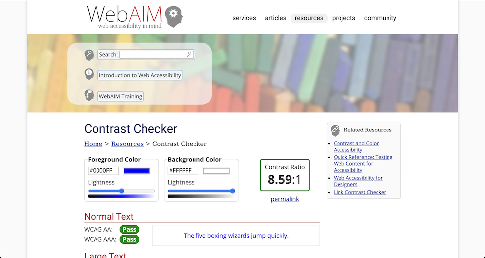
To check color contrast online, use the WebAIM contrast checker.
Chrome DevTools
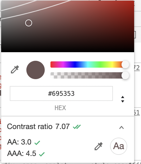
Did you know the Chrome DevTools come with a built-in accessibility color checker?
Colors and forms
An important consideration for colorblind users is making sure that color isn't the only way users can tell if there is an error with the form. For example, a red ring is not enough. Consider adding an icon or an error label.
Visual Impairments
To simulate a number of visual impairments on any website, check out NoCoffee for Firefox

Proximity of notifications from what you're doing
Helps neurological and also low vision (another curb cut example)
Setting the language
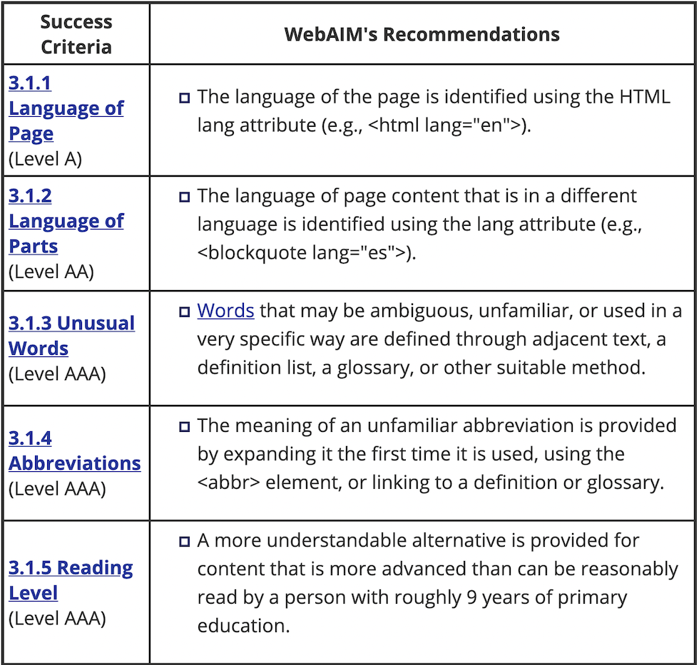
Remember to set the lang attribute both on the top level html tag as well as any sections where the language deviates from it.
Fix markup errors
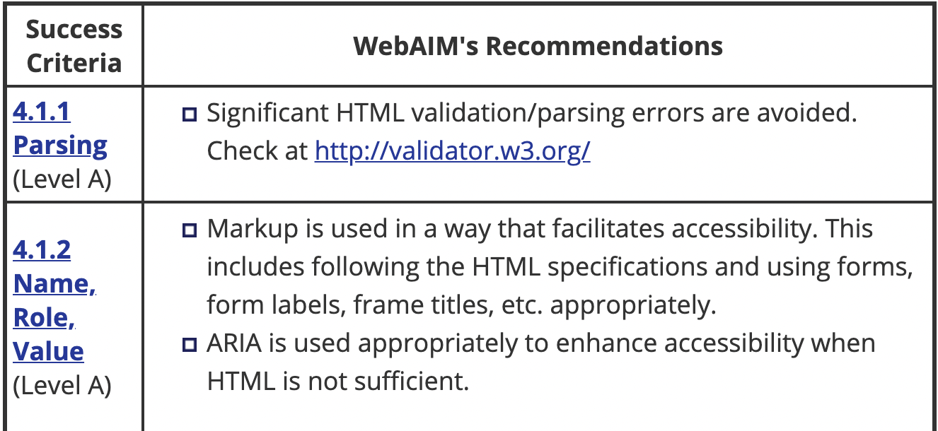
Although it won't always have a user facing effect, it is recommended that you find and fix and validation or parsing errors in your HTML.
Neurocognitive
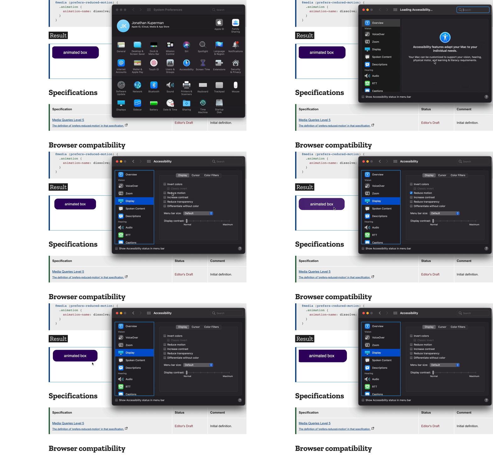
Prefers Reduced Motion
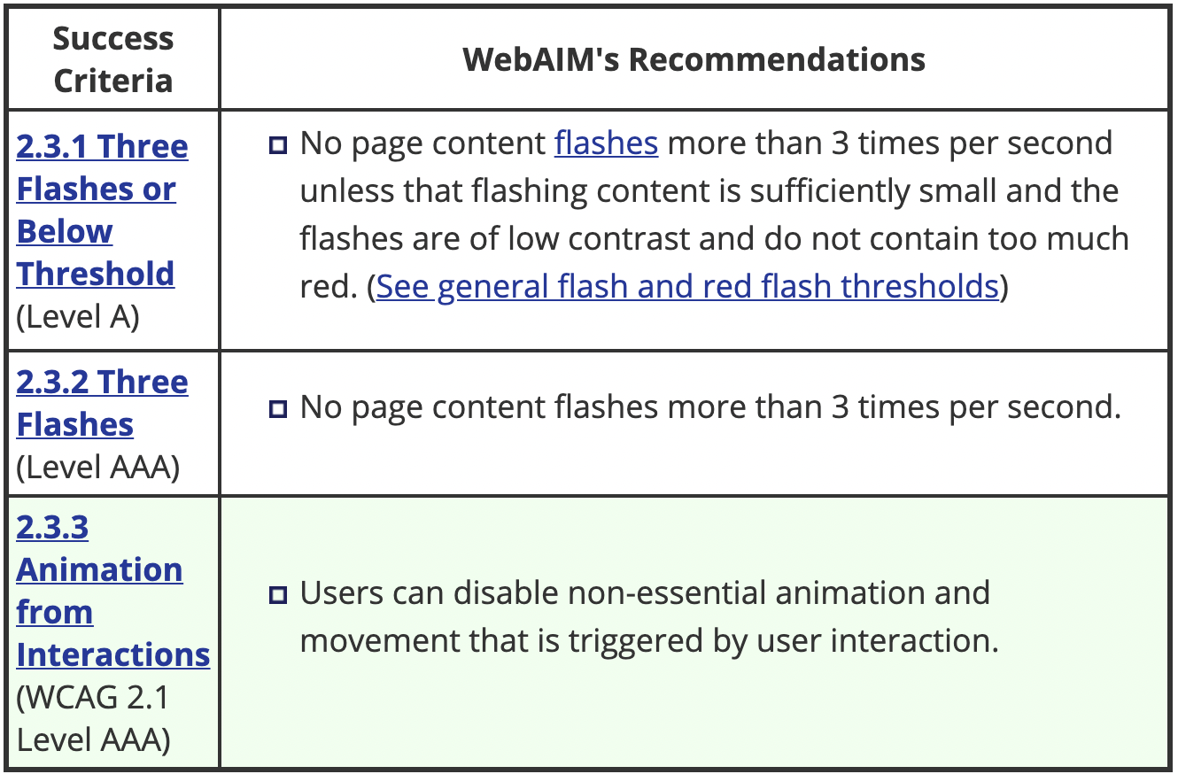
Users can set a "prefers reduced motion" setting in their operating system (Windows, Mac, Linux) and we can read that setting in CSS and swap out animations with more subtle effects.
This is important both as a preference and also to avoid causing issues for users who may suffer from seizures.
The code
HTML
<div class="animation">animated box</div>
CSS
          .animation {
            animation: pulse 1s linear infinite both;
          }

          @media (prefers-reduced-motion) {
            .animation {
              animation-name: dissolve;
            }
          }
All Together
Prefers Color Scheme
Another amazing API is one that allows us to detect if the user prefers a "light" or "dark" colorscheme.
The Code
HTML
          <div class="wrapper">
            ...
          </div>
CSS
          @media (prefers-color-scheme: dark) {
            .wrapper {
              background: black;
            }
          }

          @media (prefers-color-scheme: light) {
            .wrapper {
              background: white;
            }
          }


